Looker makes it easy to create graphics and charts based on the results of a query. Because Looker keeps query details and visualization configuration data together, when you share a query, the recipient gets the visual picture as well as the raw data.
Quick Guide: Creating A Chart
You can add an eye-catching chart to any query result set on the Explore. This page shows how to create visualizations that best show off your data.
-
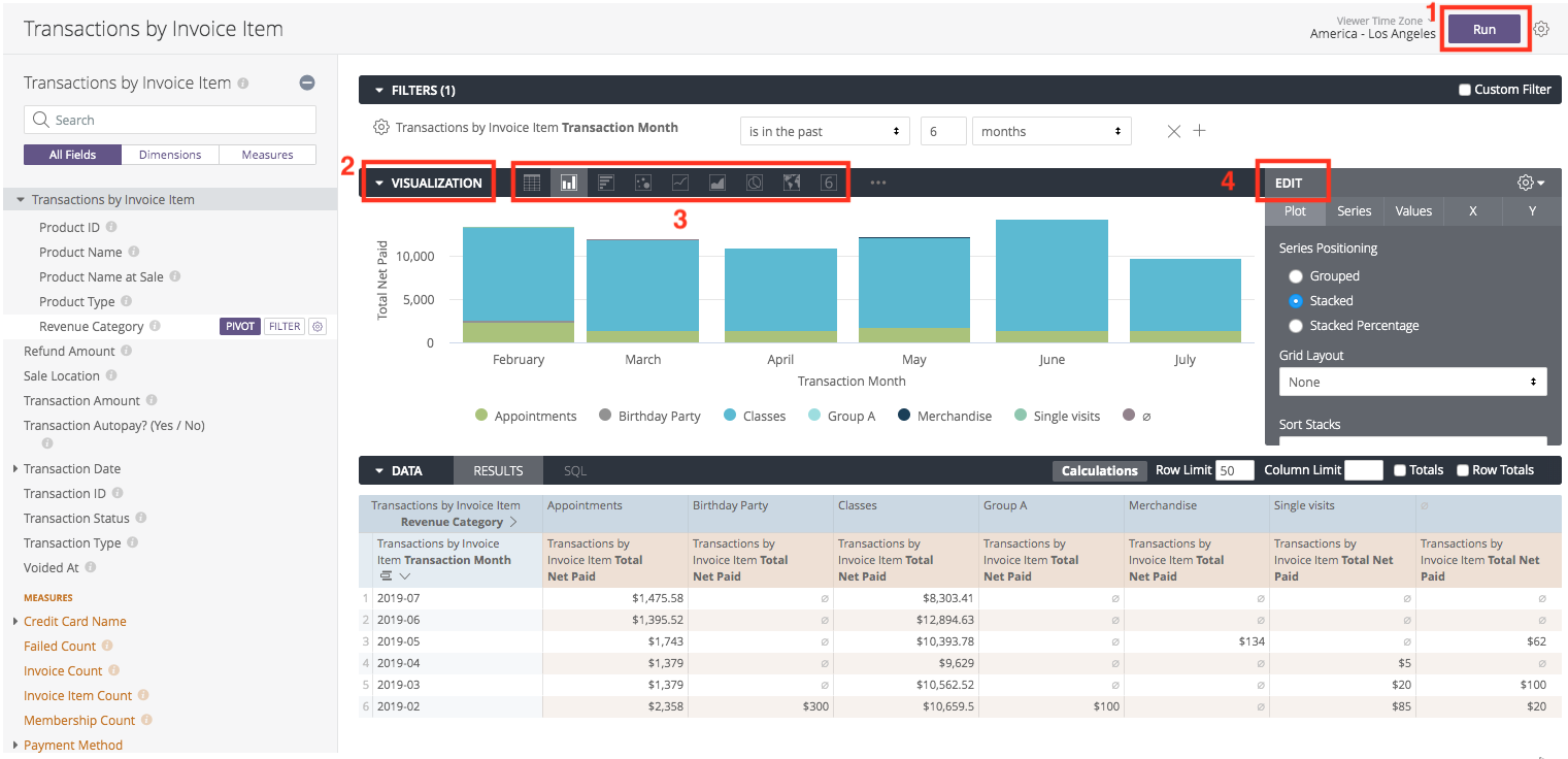
Run Query: Create and run your report query to generate the data.
-
Open Visualizations: Click the Visualization tab (located in the middle bar) to see the options.
-
Select Type: Click the icon for the chart type that best displays your data.
-
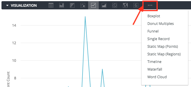
Note: For more options beyond the default icons, click the … (three dots) to the right of the displayed options.
-
-
Configure: Click Edit to adjust settings like axis names, colors, and data positioning.
You can further customize your visualization by specifying which dimensions and measures you want to be included in the visualization. If your data is missing key values, you can tell Looker to fill in those values on the appropriate part of your visualization.
Choosing A Visualization Type
Once you’ve created and run your query, click the Visualization tab in the Explore to configure visualization options for the query. Use the chart buttons to pick the visualization type that’s right for the data. For more options, click … to the right of the displayed visualization options.
The visualization type you select determines how the data series are represented in your chart. A data series is a set of related data points plotted on a chart. In a column chart a series is represented by columns of the same color, in a line chart, a series is represented by a single line, and so on.
Fine-Tuning Your Visualizations
Learn how to customize your visualizations with the Looker features below.
Customizing Visualizations With Chart Settings
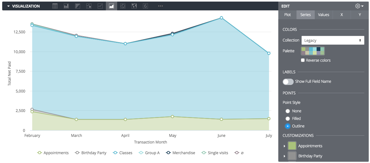
Once you have selected a chart type, go to the bottom of this page to see the documentation page for each visualization type. You can use the Edit menu to fine-tune readability and styling.
-
Point Styles: To add points to a line or area chart, go to the Series tab and choose Filled or Outline under Point Style.
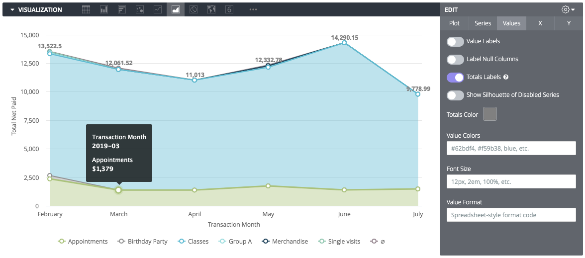
- Labels: To label value totals on the chart, go to the Values tab and check Totals Labels.
Including Multiple Visualization Types On A Single Chart
You can create complex charts that include more than one visualization type (e.g., a Line graph overlaid on a Column chart).
-
Click Edit to open the customization menu.
-
Select the Series tab.
-
In the Customizations section, click the arrow next to the specific series you want to change.
-
Change the Type box to the visualization style you want for that specific series.
Layering Rules:
-
Charts with multiple series types always layer Line and Scatter series in front.
-
Area, Column, and Bar series are layered behind.
-
You can alter the layering order of column/bar/area series by changing their column order in the Data table; the leftmost series layers on top.
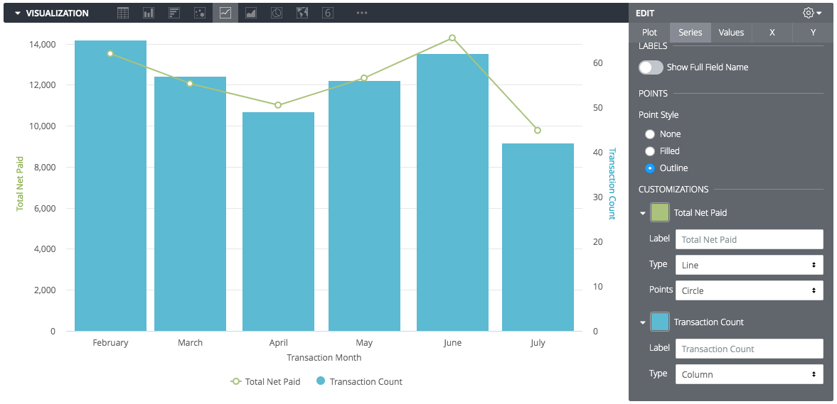
Multiple Y-Axes:
To display data on two different scales (e.g., "Total Revenue" on the left and "Transaction Count" on the right), click the Y tab in the Edit menu and drag axes to the desired position.

Stacked Charts:
-
Series of the same type will stack together, while series of other types will not.
-
Example: In a column chart with a line overlay, the columns will stack, but the line will float independently.

Specifying Fields To Include In The Visualization
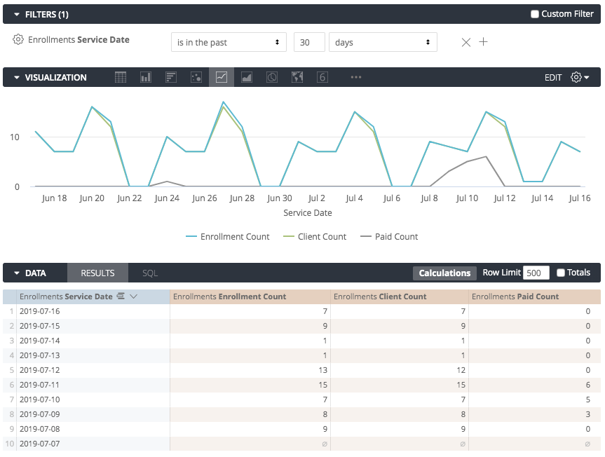
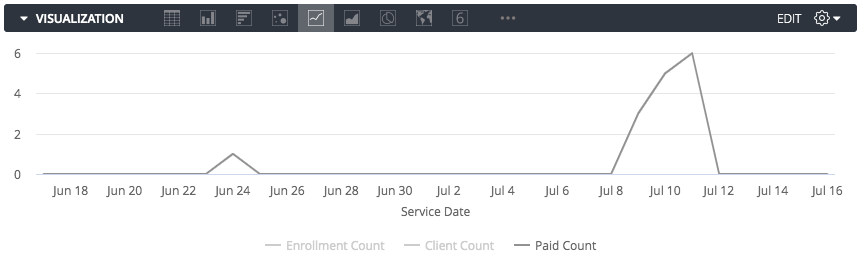
All dimensions and measures are automatically added to any visualizations you use. However, sometimes you won’t want to display every dimension or measure in the chart. In the example below, note that the measures Enrollment Count, Client Count, and Paid Count are displayed:
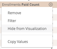
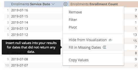
To hide a column from the visualization, select the gear icon at the top right corner of the column, then select Hide from Visualization:
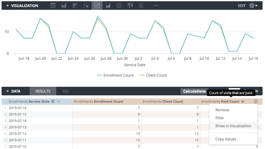
This will hide the column from the visualization. In the example below, the field Paid Count is hidden from the visualization, leaving only Enrollment Count and Client Count in the chart.
You can also enable or disable a charted series by clicking on that series in the visualization’s legend. When disabled, the series color turns grey in the legend and the data disappears in the chart. Click the series again to re-enable it.
Filling In Missing Dates And Values
Some datasets have values, such as dates, that follow a predictable pattern. A user might pull data by a timeframe and find that some dates, weeks, months, or other date types don’t have any corresponding value. By default, the data table and the visualization will display dates returned from the query and skip any dates that are missing. Looker’s "dimension fill" option lets you display the missing dates or other values in the data table and on the corresponding axis of the query’s visualization. This option is found in the dimension’s gear menu in the Data section of an Explore.
For example, this new client data shows only a few dates in which a new client joined:
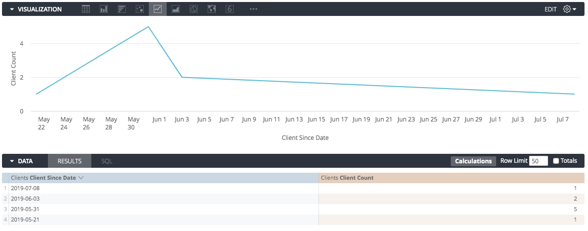
If you do not dimension fill, Looker connects the data points it has, resulting in a potentially misleading graph.
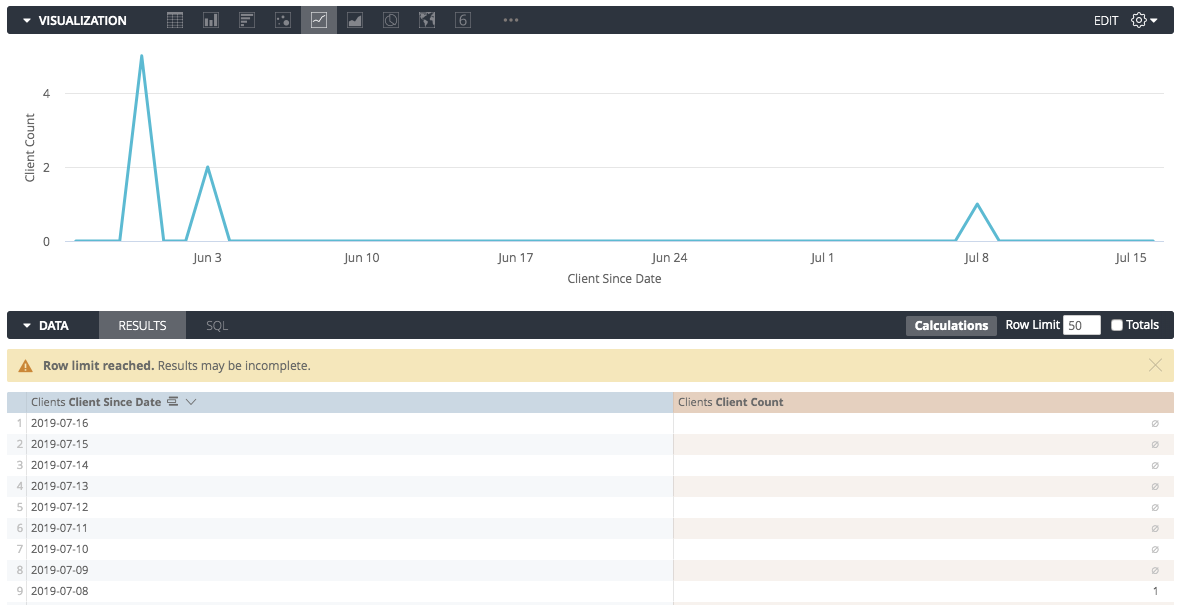
Turning on dimension fill adds the missing dates and makes the graph more informative:
To use dimension fill simply choose the Fill in Missing Dates or Fill in Missing Values option from the gear menu of the appropriate dimension:
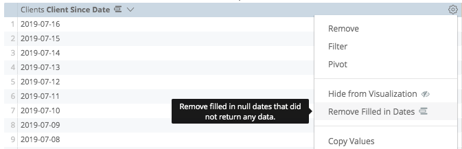
To remove filled dates or values, you can simply click on the gear menu and find the options too.
Dimension fill is available for dimensions with yes/no values, tiered values, and most date types. It can also be applied to any dimension based on a list of values, via the case parameter. Dimension fill will turn on automatically for queries that run with a single dimension and/or a single pivot, just as long as you haven’t applied filters to any measures.
Limitations:
Dimension fill is available for Yes/No values, tiered values, and most date types. It may not work if:
-
You have applied a filter to a dimension with a fixed number of values (e.g., Days of the Week).
-
You are drilling into a pivoted dimension.
-
The Auto-fill feature has been disabled by a developer.
Visualization Types
Looker has many different visualizations you can use to make sense of your data. Each type of visualization has different settings you can use to customize its appearance. Use the links below to get information about each visualization and its settings.
Cartesian Charts
Pie and Donut Charts
Progression Charts
Text and Tables
Maps
ConclusionNow that you know how to create visualizations and charts, learn how to save a Look.